Handlebars Overview
Handlebars.js is a logic-less semantic web template framework.
The 3 main parts of Handlebars are Handlebars template, data/context in JSON format and Handlebars compile function.
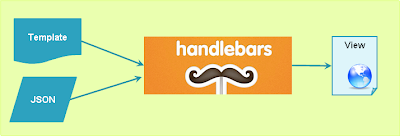 |
| How Handlebars Work? |
Handlebars Syntax/Features
- Expressions - are the basic unit of Handlebars template representing property in the data/context.
- Built-In Block Helpers - are the conditionals and loops for executing logic
- Custom Helpers - are user defined JavaScript functions to manipulate/process the data and implement any kind of complex logic.
- Path - A path is a property lookup. Nested paths to lookup property of the current data/context and Parent path ../ to lookup property on parent of the current data/context.
- Partials (sub templates) - To render a section of a template marked with "partial name" within a larger template, with another template.
- Pre-compilation – Saves time on the client and reduces run-time size of the Handlebars.js library
When to use a Handlebars.js Templating Engine?
- Application’s view will be updated frequently, especially as a result of changes to the data either from the server or the client
- Multiple technology stacks that depend on the same data (server)
- When the application has much interactivity and it is very responsive
- To develop a single-page web application with multiple views
- To easily manage HTML content; you don’t want your JavaScript code to contain important HTML markup
How to Load/Add Templates
1. In-lined Templates using <script> tag
<script id="Handlebars-Template" type="text/x-handlebars-template">
</script>
2. Externalized Templates
Storing templates in files and retrieve them using Require.js
Storing templates in DB and retrieve them using RESTful interface through Ajax calls
References
http://handlebarsjs.com
http://javascriptissexy.com/handlebars-js-tutorial-learn-everything-about-handlebars-js-javascript-templating/
Web Sites with Static Content
Any web site with static content including HTML, JavaScript, images, video etc could be migrated.
Applications
The web applications, enterprise applications, mobile web applications could be migrated.
Collaboration Applications
The collaboration applications of various sorts like Social Networking, Electronic Calendars, Mail, Meeting Organizer, Wikis, Knowledge Management Systems, Project Management Systems etc, could be migrated.
Content-centric Applications
The content-centric applications could be migrated.
Services
The RESTful Services, SOAP based Services etc could be migrated
Mobile Backend Applications
All mobile backend applications like User Management, Push Notifications, Integration with Social Networking etc could be migrated.
Cloud Computing
Cloud computing is a general term for anything that involves delivering hosted services over the Internet.
Wikipedia says “Cloud computing is the use of computing resources (hardware and software) that are delivered as a service over a network (typically the Internet). The name comes from the common use of a cloud-shaped symbol as an abstraction for the complex infrastructure it contains in system diagrams. Cloud computing entrusts remote services with a user's data, software and computation.”
Cloud Benefits
- Pay as you go
- Focus on business rather than IT
- Elasticity - Scale up and down based on business need
Cloud Models
- Deployment Models : Public Cloud, Private Cloud, Hybrid Cloud, Community Cloud
- Service Models : SaaS, PaaS, IaaS
Essential Characteristics
- On Demand Self-Service: Allows for provisioning of computing resources automatically as needed.
- Broad Network Access: Access to cloud resources is over the network using standard mechanisms provided through multi-channels.
- Resource Pooling: The vendors’ resources are capable of being pooled to serve multiple clients using a multi-tenant model, with different physical and virtual resources in a dynamic way.
- Example of resources include; computation capabilities, storage and memory.
- Rapid Elasticity: Allows for rapid capability provisioning, for quick scaling out and scaling in of capabilities. The capability available for provisioning to the client seems to be unlimited and that it can be purchased as demanded.
- Measured Service: Allows monitoring, control and reporting of usage. It also allows for transparent between the provider and the client.
What is responsive web design?
A responsive web design, built with HTML5 and CSS3, allows a website to 'just work' across multiple devices and screens.
Wikipedia definition
"Responsive web design (RWD) is a web design approach aimed at crafting sites to provide an optimal viewing experience—easy reading and navigation with a minimum of resizing, panning, and scrolling—across a wide range of devices (from desktop computer monitors to mobile phones)"
Elements of responsive web design
- Media queries
- Fluid grid concept
- Flexible images/video
Why responsive web design?
Mobile internet is predicted to overtake desktop internet usage by 2014 and a responsive web site can provide great user-experience across many devices and screen sizes.
How to make jQuery UI Spinner-Map example responsive ?
This article extends the jQuery UI Spinner-Map example, which is about Google Maps integration, using spinners to change latitude and longitude.
Example reference link : http://jqueryui.com/spinner/#latlong. This example is a very simple one which uses Google Maps JavaScript API, jQuery UI Spinner widgets to change latitude and longitude to get the Google Map corresponding to these co-ordinates.
Replace the existing CSS code between style tags with the following styles:
#map {
width:1200px;
height:800px;
}
@media handheld, only screen and max-width:1100px {
/*Small Desktop / Large Tablet View */
#map {
width:900px;
height:900px;
}
label {
font-size:12px;
}
}
@media handheld, only screen and (min-width:651px ) and (max-width:979px) {
/*Small Desktop / Large Tablet View */
#map {
width:640px;
height:800px;
}
label {
font-size:12px;
}
}
@media handheld, only screen and (min-width:481px ) and (max-width:960px) {
/* Small Tablet View */
#map {
width:480px;
height:600px;
}
label {
font-size:10px;
}
}
@media handheld, only screen and (max-width:480px) {
/* Smartphone view*/
#map {
width:320px;
height:400px;
}
label {
font-size:9px;
}
}
body {
font-size: 62.5%;
font-family: "Trebuchet MS", "Arial", "Helvetica", "Verdana", "sans-serif";
}
Check on browser
Resize the browser and test your code.
Conclusion
It is very easy to make a simple page responsive by using media queries for various mobile devices. Remember that the real implementation need to be methodological considering content, using ideal width for various devices, prototype and test etc.
Two different styles need to be created to support portrait and landscape modes of devices.
References
- http://jqueryui.com/spinner/
- http://tympanus.net/codrops/2013/01/21/ui-design-guidelines-for-responsive-design/

